


Scope
The process took me about 5 days to complete, including Benchmark Analysis, Wireframes, Moodboard, Style Tile, three Hi-Fi Prototype screens, and a Style Guide.
Approach
The design and overall appearance seem to be outdated, reminding me of the early 2010s and its early macOS design. The website feels inflexible, uncreative, and closed off, giving users the impression of an old bookstore that is not interested in keeping up with modern design trends.
Goodreads has great potential and is a social platform one of a kind. I choose to redesign it as a challenge to myself. I like reading books and sharing my experience, but never thought about doing it online. After trying the app for a couple times, I noticed that I missed out.
With this redesign, I focused mostly on the look and feel, strong use of colours, and a more “get-to-the-point” approach. It should look and feel direct, accessible, and futuristic. Floating text, fewer borders, and pleasing to look at.
Benchmark Analysis
As I was looking at the current screens (Homescreen, detailed Product page, and camera), I felt very limited. Not open-minded, not creative, not floating, and more distanced, unconnected, stuck in time, and stiff.
As I noticed these feelings, I started to think of a brand new identity.
What, if I would recreate Goodreads, from the bottom up? What do I need in a sharing, caring, and book-loving platform?
After noting these attributes, I went over to other platforms that are “all about books”, such as Storygraph and Booksloth.
Both platforms look more up-to-date, have more accessible features and generally give more of a platform type-of vibe.
Through comparing Goodreads to its competitors, I noticed that the design needs improvement to be more user-friendly and appealing to its users.
Once I finished, I proceeded to create a mood board that showcased the current design and feel, as well as my approach.
Moodboard
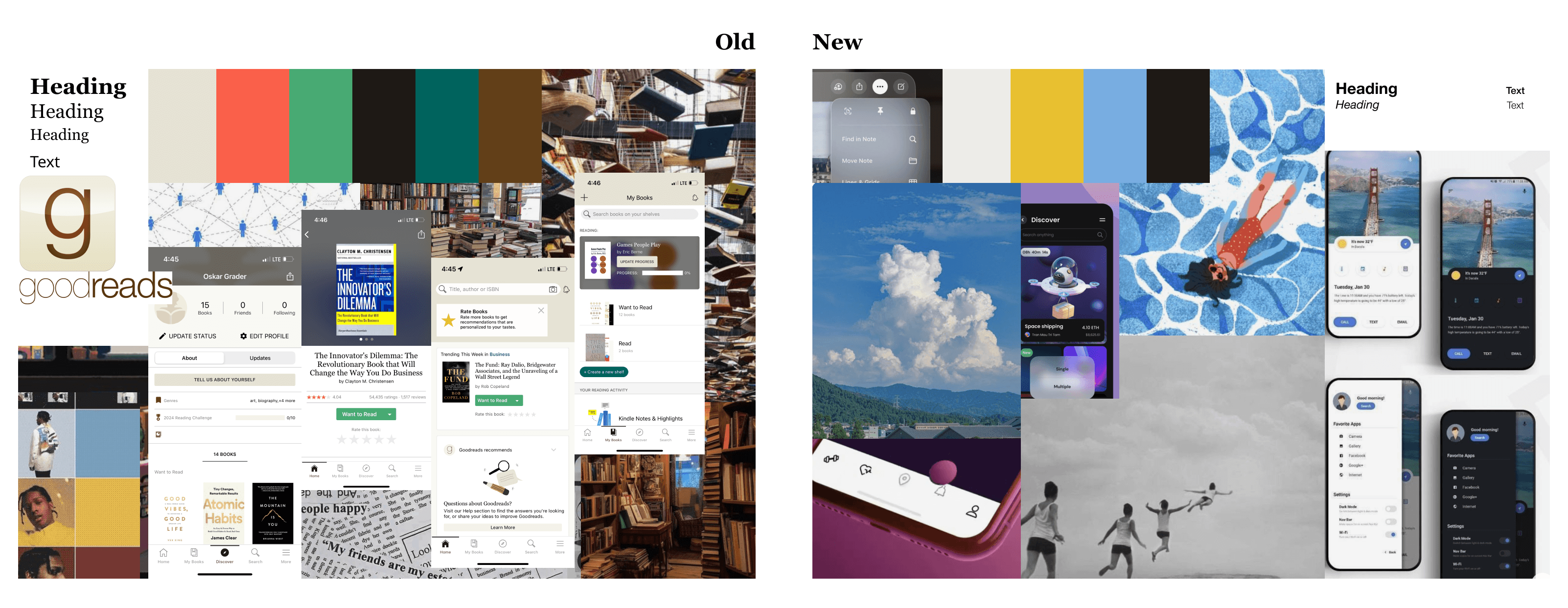
By comparing feel, colours, and fonts the difference becomes evident. The current design has more colour variety and gives off a newspaper-esque vibe, while the new approach is more open-minded and visually pleasing with a relaxed, floating feeling, with just one main colour, secondary, and supporting colours.
I was feeling inspired and began sketching out ideas for several screens. Using a similar approach to the “crazy 8's” method, I gave myself one minute to sketch out each screen. This helped me focus on the key ideas I wanted to communicate, what was important to me, and how I wanted it to look.
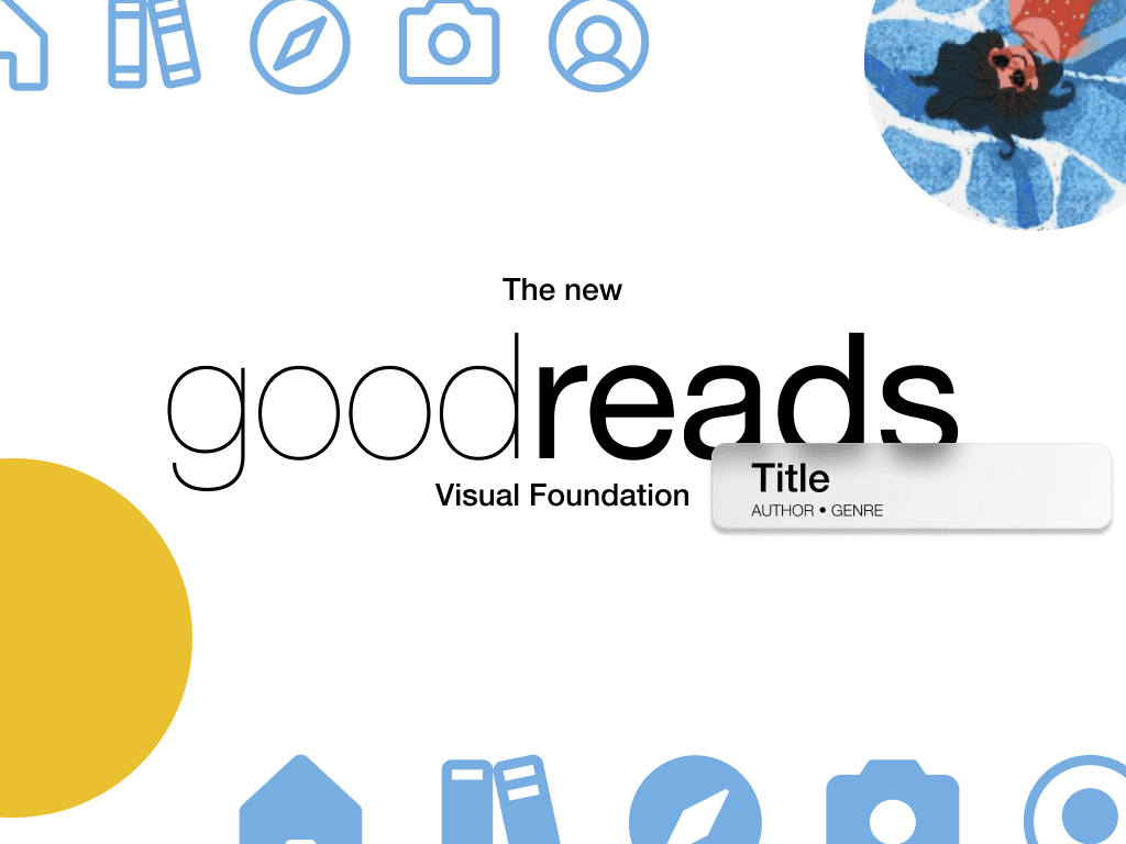
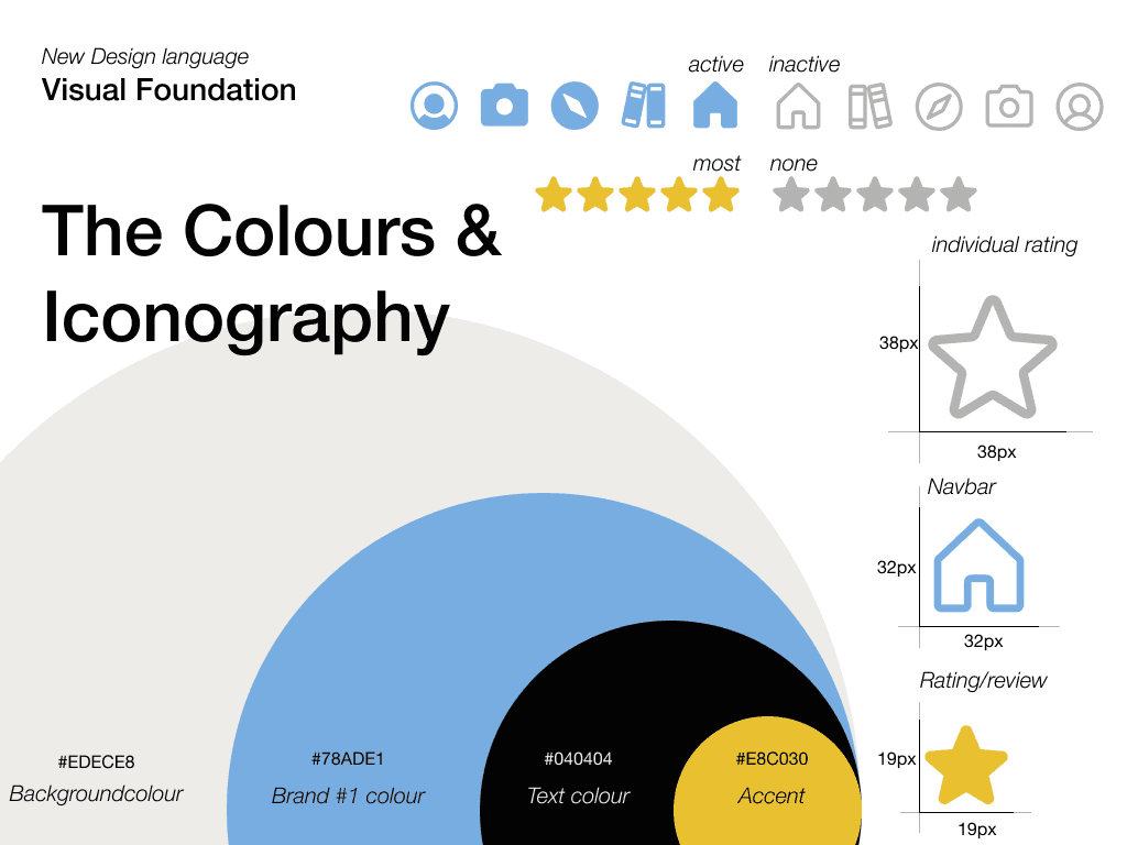
Style Tile
Buttons, Fonts, Colours, and basic icons were coming up next. For the Style Tile, I visualised some key design components to make my design more approachable.
From Components, moodboards, and sketches I put everything together and started working on the Hi-Fi Prototype. Through time constraints I decided that three screens are all I am going to focus on. The Homescreen, the product details page, and (my favourite feature) the camera.
Old vs New
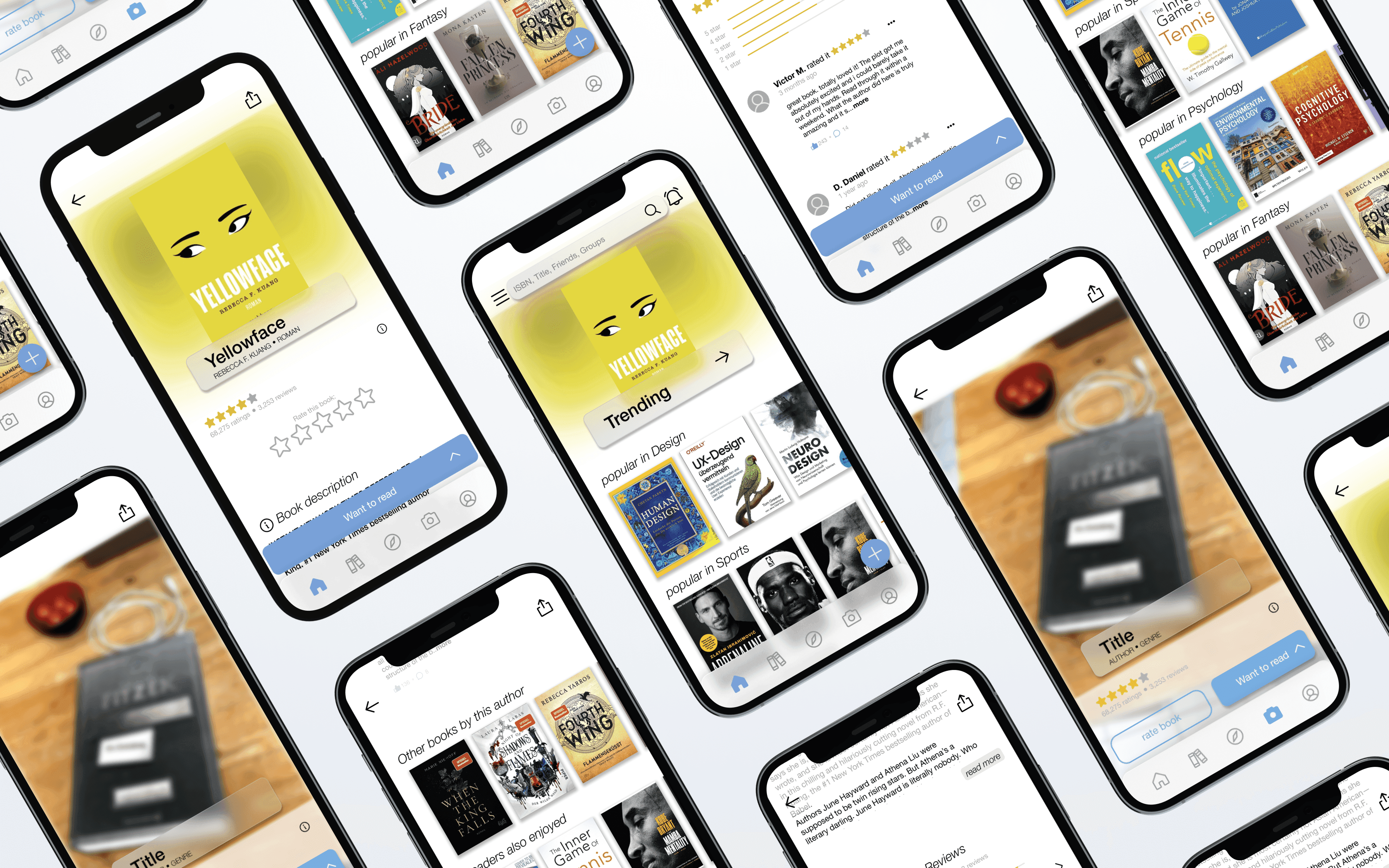
Homescreen
The main difference between the two pages is the way they use space. The new approach is designed to show more information on a smaller screen. The use of whitespace is very effective as it helps to highlight the most important information. With the new design, the user can see more at once and it’s easier to find new, inspiring books based on the user’s recent activity. Additionally, the navigation bar is fully new, with a noticeable action button at the bottom right corner and a highlighted section at the top of the screen.
My goal for this screen was to be open to new ideas, get inspired by other books, and find the next big book.
Product detail
Here the user has familiar things from the home screen. the user sees the Trending button from the home screen as a reoccurrence on this screen with the Title, author, and genre in it. Also a total re-imagination of the layers underneath. The first information for the users about the book. The reviews, the “want-to-read” button, as well as the “rate-it-yourself” section, got polished up. By scrolling down the user sees that the sections are now highlighted with an icon on the front. To provide more sustainable designs the sections of “similar books”, or “others by author” continue the design from the homepage.
I intended to make the CTA obvious, always accessible, and understandable. Central to the CTA from the original screen, is the arrow that allows the user to sort the book in the right place. For this, I initiated a tiny animation that does not take up the full screen.
Camera
Now this screen is not part of the original navigation bar and seems more like a “gadget” there.
In my design, it is central and plays a big role in the overall experience. With the camera, you can easily identify books and store them. The quick action also allows the user to rate it. Similar to the product information page it provides short information from the community like reviews, ratings, and even details about the book itself (such as ISBN, etc).
Style Gudie


Next Steps
Looking at Goodreads after comparing it to the competitors, and other more intuitive and modern-looking apps, I discovered more and more ideas. The timeframe of a little bit over 5 days just does not apply to the full app and just to key aspects.
Having this in mind, my biggest learning was to keep the focus. To understand the scope, actively decide on putting 100% to these 3 screens rather than 70–80% on 4 or 5. Stay in focus, and keep attention to the detail. Spacing, Font sizes, colours, and consistency are exactly the parts, I still need to learn on. What is a good spacing? What font size is too small? What about the colours for secondary information? Questions I will have an answer to soon.
Disclaimer: This is just a concept , all rights reserved.